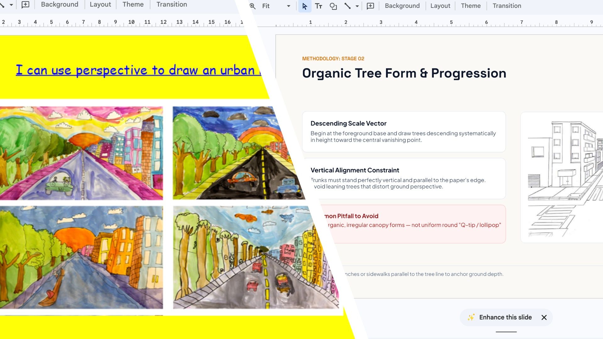
Google has recently announced that you can now use Gemini inside Google Slides to redesign entire presentations for you. I tried it and it failed to work, which means the feature might not have rolled out to everyone quite yet. However, that didn’t put me off. Instead, I uploaded a whole presentation directly into the Gemini chatbot to see if it'd redesign it that way, and it seemed to work fine.
I decided to feed it a rather amateurish PowerPoint presentation my son had been given by his art teacher at school, to see what it would do. The result? It sucked the life out of what was supposed to be a fun art lesson on perspective, and transformed it into a masterpiece of corporate nihilism.
My son’s art project presentation from his art teacher originally looked like this:
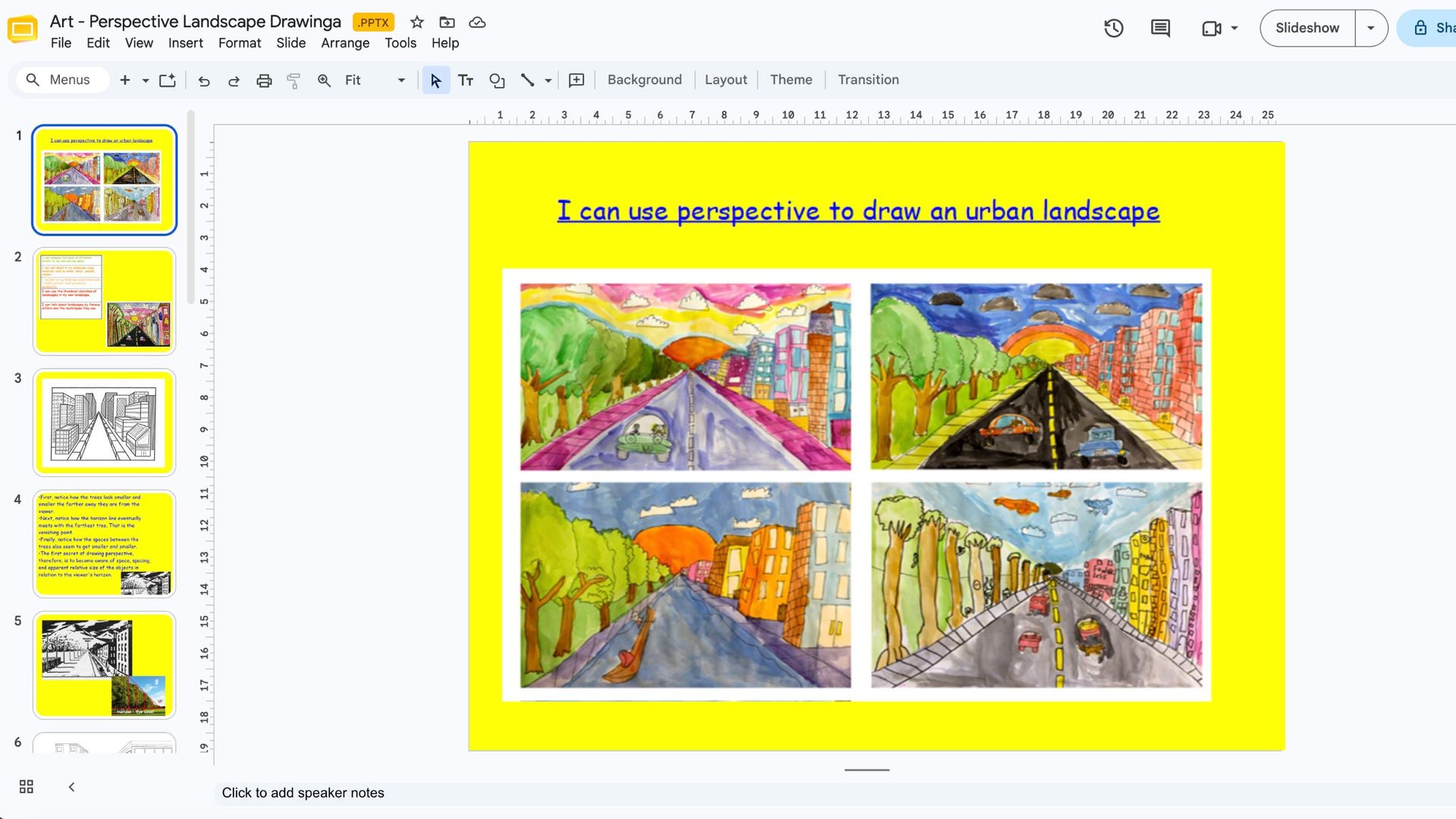
As you can see, it’s colorful and fun, but lacking in professionalism.
The prompt I used was quite long, but I wanted Gemini to get this right first time, so I wrote:“Redesign this entire presentation to make it look like it was created by a professional graphic designer.
The current slides are badly designed, with inconsistent fonts, clashing colours, poor layouts, too much text and no clear visual hierarchy.
I want you to transform the whole presentation into something polished, modern and visually impressive. You can change the fonts, colours, backgrounds, layouts, spacing and positioning of elements. You can also introduce relevant graphics, icons and illustrations where appropriate.
However, you must follow three rules:
Preserve all the factual information. Don't invent statistics, remove important details or change the meaning of any text.
Keep everything editable in Google Slides. Don't simply turn each slide into a flattened image.
Apply a consistent visual style across the entire presentation, while making sure individual slides have enough variety to remain interesting.
You have complete creative control over the design. Don't ask me any questions — just redesign all the slides and show me the finished result.”
Was this really what I wanted?
“Your slide deck on Urban Perspective Landscape Drawing is ready!” Gemini happily announced after about a minute. “Feel free to take a look and let me know if you'd like to make any edits”, it informed me.
What it produced was this:
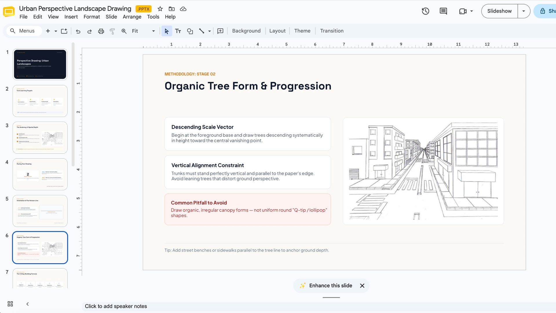
You can see immediately that it looks much more professional, but what Gemini had done was introduce a much more formal teaching structure, with sections on learning objectives, spatial depth, architectural techniques and a two-week project timeline. I can’t imagine being a hit with preteens.
It also introduced additional instructional material, changed the tone, and reorganised the original lesson.
For example, the redesigned deck includes terminology such as “Architectural Precision” and “Progressive Interval Spacing”. These are perfectly reasonable concepts in an art lesson, but they sound more like something from a professional design course than a school project.
By adding and restructuring teaching material, it arguably went beyond its remit to preserve the original information, and in doing so sucked the joy out of the project.
Ok, I’ll admit that my prompt specifically asked Gemini to make the presentation look “professional”, so it wasn't entirely unreasonable for Gemini to go in that direction. But I asked it to improve the design, not change the personality or purpose of the presentation.
Work vs fun mode
If you’re going to use Gemini for designing your presentations then I think it’s well worth keeping in mind that it is very much in a work mode for the assignment. I actually went back to Gemini and voiced my criticisms to see if it could have another go:
“I asked it to improve the design, not change the personality or purpose of the presentation”, I wrote. “This still needs to be a fun project for kids to try. Can you try again?”
“I will now redesign the presentation to strike the perfect balance: vibrant, encouraging, fun, and clearly targeted at students and young artists, while replacing the harsh neon yellows, chaotic layouts, and unreadable fonts with clean, professional art-studio styling, friendly typography, and colorful, inviting cards”, responded Gemini.
After a short wait it produced this:
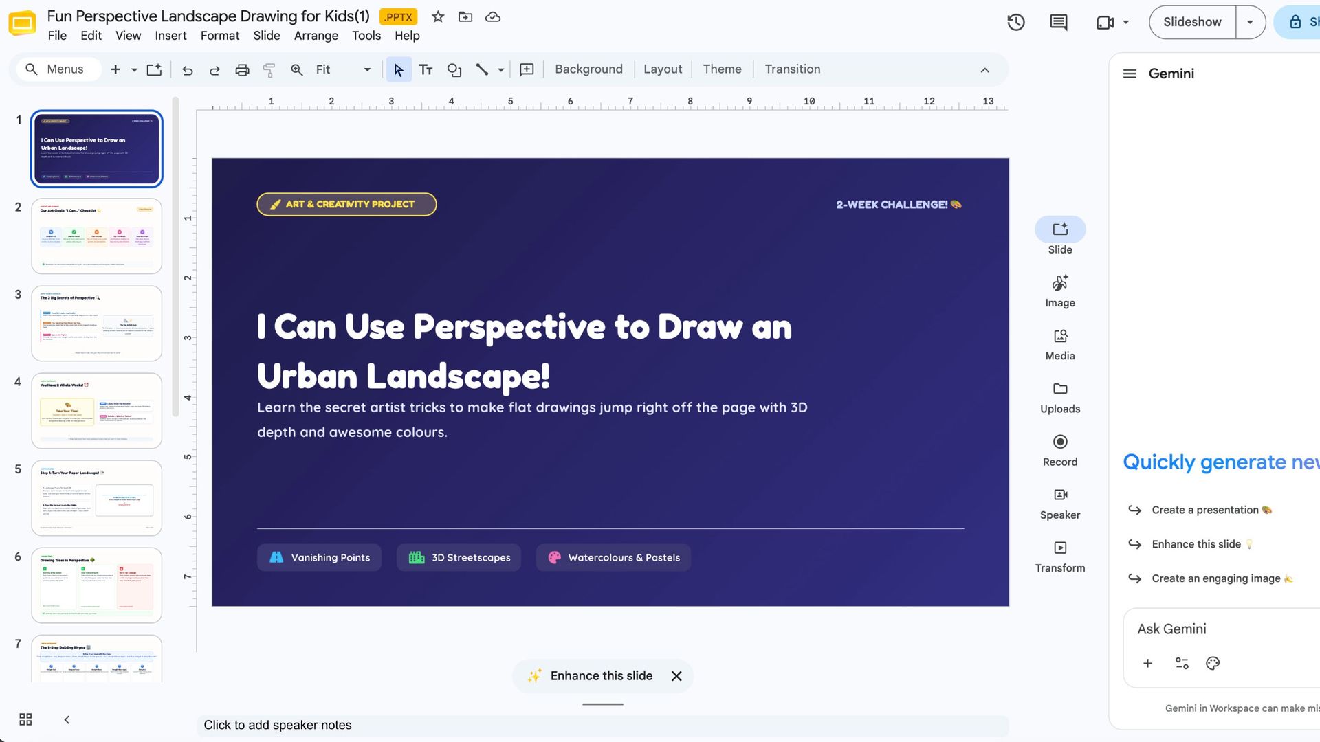
It was still the same presentation it produced earlier, but with slightly more fun fonts and language. A lot of the visual elements of the original had still been removed. The problem was that Gemini seemed unable to escape its original idea of what a good presentation should look like. It was like asking someone to make a corporate training presentation more fun and watching them add a few emojis. Overall, I still didn’t like it. What should have been a tidying up job has turned into a reinvention I didn’t think I’d asked for.
If this experiment has taught me anything, it's that you shouldn't automatically assume AI knows what makes a presentation better. Gemini certainly made the original look more professional, but in doing so it lost sight of what made it work in the first place. Sometimes a colorful, slightly haphazard school presentation is exactly what it needs to be for its audience. Sometimes the chaos and mess of a design are what keeps it human, and that’s something that AI has a problem understanding.